Sunday, August 26, 2018

Japanese Double Pamphlet


I'm working through my current journal so fast that I've made my next one already.  I decided on a square format this time (7"), with the same Deserres Fabriano mixed media paper.

This is my first Japanese Double Pamphlet, which allows for two signatures.  I got the instructions from Roz Stendahl's free pamphlet binding class.

The Japanese Double Pamphlet can be made with a "split cover", which allowed me to use up some painted paper that wasn't wide enough to go all the way around from front to back.  In the photo below, you can see the covers in the middle of the two signatures.  If you make the cover using a single piece, this part would be a pleat, rather than two pieces.  It is hard to explain and a bit hard to line up all the pieces, which are stitched with a single 5 whole pamphlet stitch. 


I did have two strips left over so I made a couple of bookmarks for The Bookmark Project.

Thursday, August 23, 2018

So What's in that New Journal?

 Here's a sample so far:


some notes from a book I'm reading,


a sketch or two (one to remember a great day with art friends),


a wonky sketch from a local park, and


a sketch of the Eiffel Tower from a photo I took in 2005.

I'm quite happy with the Eiffel Tower sketch.  Back in February, I sketched the Tower from instructions that I found on the Internet.  This time, with a little help from Liz Steel, I was able to do it quickly, from a photograph.  I used just a few set-up lines and the whole thing took less than 20 minutes.  Not quite "5-minute sketching", but I'm getting there!

Wednesday, August 22, 2018

New Journal!


I did it!  This picture shows my new journal on top of a stack of four(!) journals that I finished this month.  I set a goal at the beginning of 2018 to finish all of my "in-progress" journals and to begin a single, chronological journal.  I didn't know how long it would take - I was hoping just a few months.

My new journal is a single signature of twenty-four pages and measures 8 1/2" x 5 1/2".  The paper is a new mixed media paper made by Fabriano from my local art store, Deserres.  It is the perfect weight for me - not too precious for sketching, smooth for pen work and/or stamping, but sized for watercolour.  So far I'm loving it!  My theory is that by keeping the page count low I can finish it and make something completely different when I want a different type or size of paper.

Saturday, August 18, 2018

Tackling More Complex Subjects


Notre Dame, Paris

Thanks to Liz Steel, I've become confident enough to tackle architectural sketching.  Liz  gave up her job as an architect to become a full time artist and sketching teacher.  She gives lots of free tips on her blog and I'm looking forward to reading her book. 

I sketched this from a photo I took in 2005.  These are my favorite flying buttresses!


Friday, August 17, 2018

Wednesday, August 15, 2018

Handsome Men in Hats


I'm not familiar with Dana Andrews, but I do like drawing handsome men in hats.

Monday, August 13, 2018

One More Journal Finished


This closes off another journal - I'm one step closer to consolidating my journaling into one book.  This was done with a black watercolor pencil on a gelato background.  I think the red dots are felt pen.  It's another page done over several sessions; I can't always remember exactly what has gone into the mixed media melting pot.

Sunday, August 12, 2018

Don't Try This at Home: Drawing on Yupo


Yupo is a synthetic paper that I bought for alcohol inks.  (That's what the stray blue splotches are).  Anything water-based beads up immediately.  I wouldn't normally use it for drawing but there was a page in this journal that I want to finish. Graphite or pencil crayon works better than ink does on Yupo, but it isn't ideal either.

It's all practice though, right?

Saturday, August 11, 2018

Life Drawing (Library Style) and Surviving a Heat Wave


I went to my local library this week to get some respite from the heat.  In addition to cooling down, I also managed to use up several sheets of canvas paper in a journal that I'm trying to finish.

Roz of "Roz Wound Up" is one of my journal heroes.  She draws and paints like a pro (OK, she is a pro), keeps a visual journal and makes her own journals.  She wrote (in the blog post linked above) that one way of using up a partially filled journal is to take it to life drawing class.  I don't do life drawing classes, but I can go somewhere and draw people, right?  She was right....I burned through several pages in half an hour.

I wasn't going to post all of these drawings, but now that I see them, they kind of tell a story about my afternoon.  First I did some warm-ups. 


 If only those people would stop moving!  Of course I could have chosen people who were sitting quietly rather than chatting and playing with their phones, but where's the challenge in that??


 Frustrated, I drew the self-serve Holds Shelf.  (Note the time on the clock; it tells you how long each of these drawings took.)


The computers are very popular:


And yes, there was actually one person reading:


All in all, a successful and cool way to spend some time!  Now I have to get back to that journal.....


Friday, August 10, 2018

Saran Wrap Backgrounds


Part of finishing up journals is using jazzy backgrounds.  They make great backdrops for calligraphy, if they're not too bumpy.  I love to let saran wrap dry on top of watercolor (or Inktense),  so I had a couple of these to fill.


Thursday, August 9, 2018

More Looking Required


Neither of these look like The King so I'll keep on trying.  It makes me wonder what I have to capture in order to get the essence of him.  What makes Elvis Elvis?  Drawing teachers often talk about how much looking is required to draw well.  "Spend more time looking at your subject than at the paper," they say.  More looking at Elvis is obviously required.


Wednesday, August 8, 2018

Enjoying the Cool of the Morning

Robert Mitchum
Platinum Carbon and Pentel Brush Pens
6" x 6" Journal 

Morning is the best part of the day for me in this current hot weather here in Vancouver.  I can only use my office/studio then, so I'm making the most of those cool hours.

This drawing finishes up my 6" x 6" journal.  Yay!

Tuesday, August 7, 2018

New Project


I've embarked on a new drawing project.  This will help me finish up all those journals - another current project.


Friday, August 3, 2018

The Joy of Watercolor


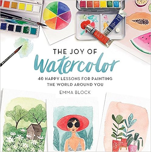
Emma Block, in her new book The Joy of Watercolor:  40 Happy Lessons for Painting the World Around You, has approached watercolor with fun and simplicity.  "My approach to watercolor painting is to break all the rules and work in a way that makes you happy."  She writes of the  surrender and spontaneity necessary to experience the joy of watercolor, my favorite painting medium.

The unique thing about the style of Emma's work as presented in this book is probably found in Emma's background and choice of career.  She is a successful illustrator and also teaches watercolor classes in London, England, where she lives.  Her style as an illustrator matches perfectly with journal keeping, and I give top marks to anything that is approached simply.  She calls this "modern watercolors".

Although the approach is simple there is strong and practical instruction in the opening, introductory chapter.  She describes the choice between pans and tubes as personal, and I find myself using both for exactly the same reasons she writes about.   She reminds us that liquid watercolors are dye-based, providing beautiful vivid results, but that they aren't as lightfast as traditional watercolors.  Brushes are well described but in the projects she simply suggests a small, medium or large brush rather than a very specific size.  Paper and the (tedious, in my opinion) subject of stretching paper is covered, along with her simple recommendation.  She writes about color theory in a way that got me  inspired to start mixing paints.  The basic techniques of using watercolor washes and layering are covered in just a few pages. 

This introduction takes just 35 pages, so that we move quickly to painting the world around us!  Subsequent chapters cover flowers, fruit, plants, objects, food, people, animals and "on location" painting.  Each chapter has several projects and are labelled beginner, intermediate and advanced.  The supplies needed for each project are listed, including color swatches for those of us who can't remember exactly what Viridian green looks like.  That way, we can use what we have rather than buying specified colors.  The instructions are detailed and clear.  

There are lots of more advanced techniques included in the project instructions.  This is a big book (239 pages) filled with inspiration.  It opens nice and flat, and at 7 1/2" square (closed), it is a nice size.  I was able to leave it open beside me while I painted without using up too much of my small desk space.

Whether you are a beginner or need to inject some inspiration into your sketching practice, this is a great book.  Thanks to Emma and Running Press for sending it to me!

Wednesday, August 1, 2018

July


My sister, Dianne, chose "monochrome" as the theme for July's calendar.  This is my interpretation.